
Consumer Climate — Home Electrification
Making home electrification feel simple, fast, and worth doing.
QuitCarbon guides homeowners from gas to clean electric, with free expert advice, personalised plans, rebate identification, and vetted contractors. They needed an animation that made this multi-step service feel effortless rather than daunting.
30s
Full service explained — free guidance to vetted contractor
2D
Illustrated character animation — a different visual register from our 3D work
12
Storyboards developed and approved before full production
B2C
Consumer audience — homeowners, not investors or technical teams
the brief
A multi-step service that needed to feel like one easy decision.
QuitCarbon makes home energy upgrades simpler, more affordable, and more accessible — guiding homeowners from their current gas-powered setup through to a fully electrified home with clean alternatives. Their service covers expert guidance, personalised plans, rebate and tax incentive identification, and connections to vetted local contractors.
The challenge wasn't that the service was complicated. It was that listing everything it does made it sound complicated. Potential customers were seeing a multi-step process and feeling daunted before they'd even started. The animation needed to flip that — making the whole journey feel like a single, confident step in the right direction.
"They provided an easy-to-follow structure and sequence of spec documents, live interviews, progressive refinement of the script, rough versions, then near-final cuts — it was very efficient, resulting in an outstanding piece of work."
Cooper Marcus — CEO, QuitCarbon
our approach
Getting the messaging right
01
Script before visuals
The script went through multiple rounds of live interviews and progressive refinement — aligned closely with QuitCarbon's goals and voice — before a single frame was drawn. Getting the messaging right first meant the visuals had a clear brief to work from.
02
Storyboard & Animatic
A detailed storyboard gave QuitCarbon a clear visual preview of the final animation — allowing them to review the creative direction, provide feedback, and sign off before full production began. No expensive rework, no surprises.
03
Brand-first animation
QuitCarbon's brand colours, shapes and even their logo animation became active elements in the film. The illustrated 2D style was chosen deliberately — warmer and more accessible than technical 3D for a consumer audience unfamiliar with electrification jargon.
visual approach
2D illustration — a deliberate choice, not a default.
Most of Studio Till's work lives in 3D — precise, technical, premium. QuitCarbon required a different register entirely. Their audience is homeowners, not engineers or investors. The goal was warmth, accessibility and clarity — not technical authority.
A 2D illustrated style with character animation, brand-native shapes and a consumer-friendly colour palette hit that brief exactly. It feels approachable without being generic, and it's unmistakably QuitCarbon — right down to the animated logo treatment.
pre production
Every frame agreed before production began.
The storyboard and animatic gave QuitCarbon's team a tangible preview of the animation's look, pacing, and narrative structure — long before any final frames were produced. Feedback at this stage is fast and cheap. Feedback after render is neither.

00:03
VO: Are you ready to make your home safer and more comfortable
Action: Homeowner typing on the laptop

00:06
VO: QuitCarbon's no cost service makes it easy to upgrade
Action: A tablet device with the QuitCarbon website.

00:11
VO: to heat pumps, induction cooking
Action: An American home with upgrades added one by one

00:19
VO: connect you with a vetted contractor
Action: Introduce the contractor on screen with attached star rating.

00:24
VO: make their homes climate friendly
Action: more great reviews fill the screen, overlapping with depth of field.
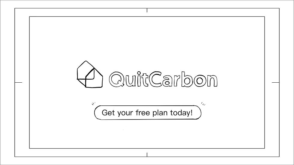
00:28
VO: Join QuitCarbon today!
Action: Logo & call to action appears on screen.
The creativity was excellent — brand colours utilised to wonderful effect, and even some clever animation of our logo.
Cooper Marcus, CEO , QuitCarbon
visual approach
Complexity turned into clarity — in 30 seconds.
The final animation communicates QuitCarbon's full end-to-end service — expert guidance, personalised plan, rebate identification, vetted contractors — in a format that feels effortless rather than overwhelming. Potential customers can understand the whole value proposition before they've had a chance to talk themselves out of it.
The animation was built to work across QuitCarbon's website, their social channels, and inside sales and marketing materials — one production, ready to go everywhere without additional editing on their side.
The creativity was excellent, with our brand colours utilised to wonderful effect and even some clever animation of our logo. Studio Till was highly professional and delightfully accommodating.
Highly recommended."
Cooper Marcus
CEO, QuitCarbon